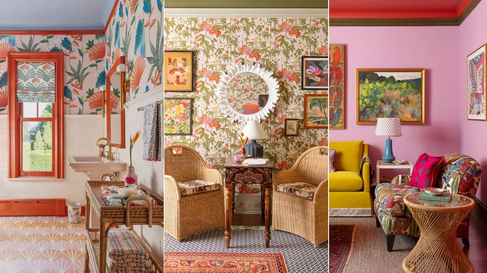
Busy Pattern Mixing – Create Interest Without Visual Chaos
Pattern can make a room feel layered, personal, and memorable. The trouble starts when every surface competes for attention. Busy pattern mixing works best when prints share a clear relationship through color, scale, or style instead of fighting for dominance.
The goal isn’t to remove personality. It’s to create enough visual order that bold choices feel intentional.
Choose One Pattern to Lead the Room
Start by deciding which pattern deserves the strongest visual role. A large floral rug, striped wallpaper, patterned sofa, or oversized geometric curtain can become the anchor while other prints stay quieter.
Looking through interior styling inspiration can help you notice how successful rooms usually have one obvious visual leader. Without that hierarchy, several equally bold patterns can make your eyes jump constantly around the space.
Let Supporting Patterns Stay Smaller
Once the main pattern is established, introduce supporting designs at a different scale. If the dominant print has large shapes, use smaller checks, narrow stripes, or subtle repeated motifs nearby.
Changing scale helps patterns coexist without appearing identical or overly coordinated.
Connect Patterns Through Color
Different patterns feel more intentional when they repeat one or two related colors. They don’t need identical palettes, but some connection should exist.
A navy floral chair, for example, can work beside cream-and-navy striped cushions because the shared navy creates continuity. Neutral backgrounds also give patterned pieces breathing room.
People experimenting with textiles often find comfortable bedroom ideas useful for seeing how bedding, curtains, rugs, and upholstered pieces can share color without using the same print.
| Design Choice | Better Approach | Common Problem |
|---|---|---|
| Pattern scale | Mix large and small | All prints same size |
| Color | Repeat 1–2 tones | Unrelated palettes |
| Placement | Create focal areas | Pattern everywhere |
| Background | Leave quiet surfaces | No visual rest |
Give the Eye Quiet Places to Rest
Pattern needs contrast, and plain surfaces provide it. A patterned room often feels more sophisticated after removing one decorative print rather than adding another.
Use solid walls, simple lampshades, plain furniture, or neutral flooring to break up visual activity. Even outdoor spaces demonstrate this principle: outdoor design references often balance textured materials with large areas of visually calm paving, water, or planting.
That same restraint works indoors.
Separate Strong Patterns Physically
Two bold prints can work beautifully when they aren’t touching. A patterned rug and wallpaper may feel balanced when plain flooring edges, baseboards, or furniture create separation.
Distance gives each design its own territory. This is especially useful in smaller living rooms where a patterned chair, curtains, and rug may otherwise merge into one busy visual block.
Repeat Shapes Instead of Exact Prints
Patterns can also relate through shape. Rounded flowers may connect naturally with curved geometric motifs, while angular stripes often pair well with checks or sharp abstract designs.
This creates coordination without making the room look like a matching furniture set.
Where Pattern Mixing Goes Wrong
The biggest mistake is assuming more variety automatically creates more character. Too many unrelated prints can make a room feel accidental rather than expressive.
Another problem is spreading pattern evenly across every surface. Successful rooms usually have stronger and weaker zones. A bold rug beside patterned curtains may work, while adding equally loud wallpaper, cushions, artwork, and upholstery can push the room past its visual limit.
Editing matters as much as decorating.
Frequently Asked Questions
How many patterns can you mix in one room?
Three patterns are often manageable when their scales differ and their colors connect. Larger rooms may handle more, but visual hierarchy matters more than an exact number.
Can floral and geometric patterns work together?
Yes. Florals and geometric designs often complement each other because their shapes contrast. Repeating one shared color usually helps them feel connected.
Should every patterned item match?
No. Exact matching can make a space feel overly coordinated. Related colors, similar visual weight, or repeated shapes usually create a more natural result.
Build Interest With Restraint
Strong pattern mixing depends on control, not caution. Choose one design to lead, vary the scale of supporting prints, repeat a few colors, and protect some quiet surfaces.
Before adding another patterned item, look at the entire room from the doorway. If your eye has nowhere comfortable to settle, remove or simplify one element. Good pattern mixing should feel energetic without becoming exhausting.